ALAN HYNES

THEY LIVE VINYL PACKAGING DESIGN

Graphic Design, Music, Record Covers, typography, Uncategorized

No Comments


Share this post

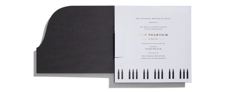
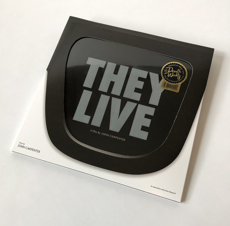
Design for Death Waltz’ re-issue of John Carpenter’s original score for 1988’s They Live. Read below for an insight into my design process and check out the Mondo video linked here the see the packaging in action.

As of this writing, January 2019, google returns 9,860,000,000 hits for the search term “They Live” – that’s almost 10 Billion. TEN BILLION!!!. Since its release 30 years ago so much has been written about this films’ continued relevance; it’s prophetic vision, it’s commentary on capitalism and conformity and of course its legendary six-minute fight scene.

Coupled with so many prominent artists influenced by and appropriating its visual currency and language, to say that John Carpenters’ cult classic has permeated the fabric of our popular culture would be a massive understatement. In fact They Live is not so much a cult classic as much as it is simply just a classic.

Rather than redundantly discuss further the movies lasting impact I will instead outline my approach to the more mundane design related aspects and how I incorporated some of the themes and ideas from the film into the packaging for the soundtrack.

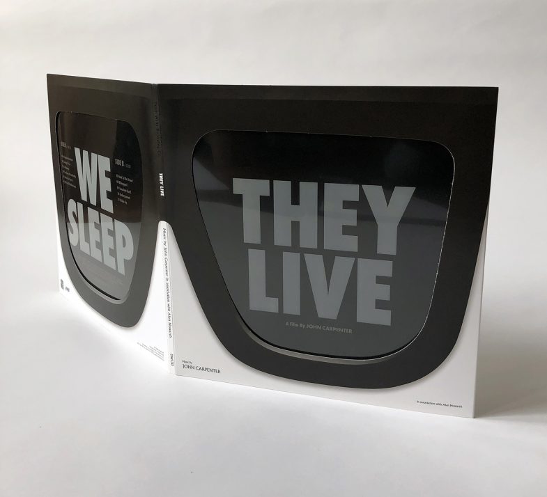
First let’s be clear about what this package actually encompasses and what the design entailed; It’s a pair of glasses, it’s a record sleeve, it’s an advertising campaign, it’s a magazine, and it’s a magic trick. It involved packaging design, product naming, product branding, logo design, copywriting, photography and illustration. All of these elements had to be individually conceived and created but also had to work in tandem to create a cohesive design relevant to the movie.

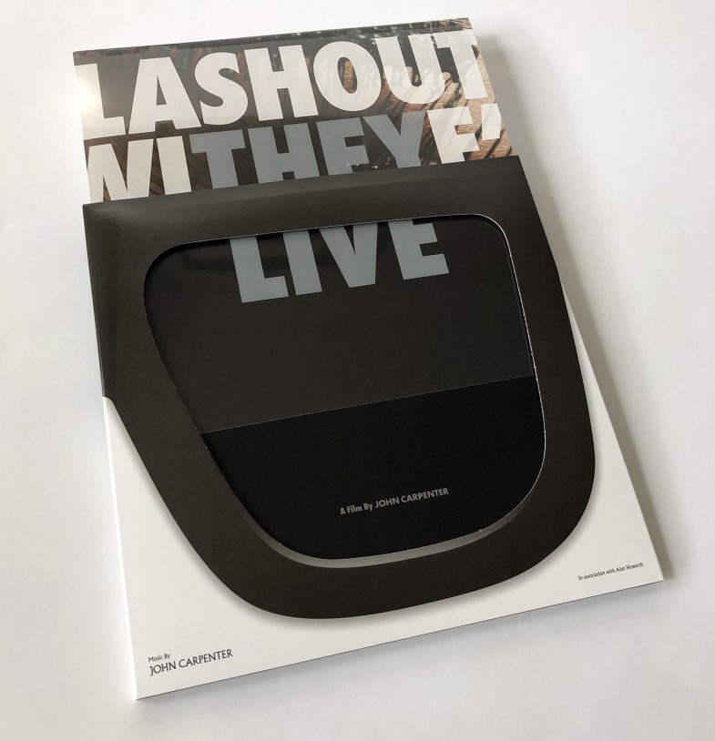
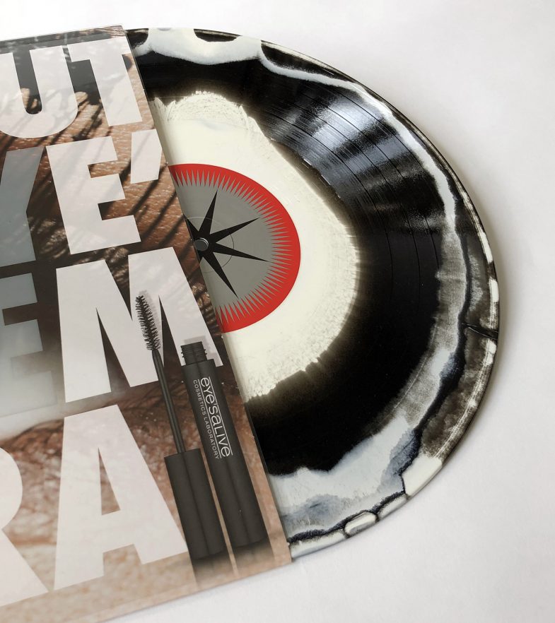
In the film a pair of sunglasses reveals a hidden reality, and as per movie the putting on and taking off of the glasses is mimicked through the action of sliding the record in and out of its sleeve – with the stark white letters of the title magically changing to a full color advertisement.

The trick itself is based on an old rainy-day paper construction activity for children wherein a black and white drawing amazingly appears to fill with color as it slides out from a sleeve. For the record packaging I adapted the effect to work typographically, sticking with the iconic Futura Extra Bold Condensed typeface that is so synonymous with the film’s iconography.

Magic tricks work within strict parameters and these placed substantial restrictions on the rest of the packaging. It meant that a large part of the design was dictated by where the letters “THEY LIVE” and “WE SLEEP” sat on the front and back covers. This required not only creating the product, naming it and branding it, but also coming up with ad slogans that included those exact letters, in that exact order, that fit within the space, and that made sense as slogans in relation to the products they were advertising. Phew.

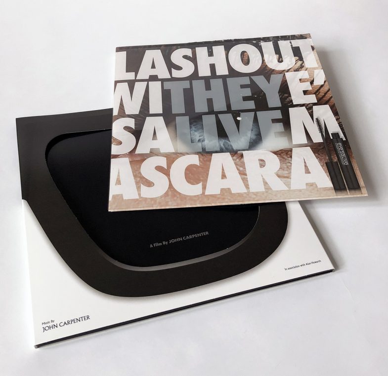
The two products depicted in the ads represent the alien and the human demographic respectively. For it’s ability to conceal I chose to use a cosmetics product as a metaphor for the hidden oppressors, and the slightly aggressive language of the “Lash-Out With Eye’sAlive” tagline (spoken in a in a snarky-supermodel-from-London way) aligns with an oppressive alien ruling class and contrasts the vacuous, over-friendly adspeak of the “EverSleep” slogan which innocuously queries before reassuring; “Still Up? Now EverSleep Is Here For U”. The newly formulated sleep aid promises slumber and I have used it as a less than subtle representation of the oblivious state of most of the human populace depicted in the story.

Ironically the grammatically incorrect but vaguely faux-Euro looking eye’salive name for the mascara product was conjured up as a result of the kerning problems the ad slogan created. In retrospect it makes for a more memorable and appropriate brand logo by virtue of its’ unnecessary inclusion and is somewhat representative of the superfluous trappings of the industry.

For the insert I applied the best known, or at least the most oft-repeated line from the film: “I have come here to chew bubblegum and kick ass, and I’m allll outta’ bubblegum” to a Bazooka Joe style comic wrapper. Whilst thankfully I didn’t have to write the dialogue for this element of the package design, the 3 panel comic strip still needed drawing.

I am not a cartoonist and it took a few attempts – best described as ‘learning experiences’ before I was able to produce an acceptable facsimile of the style. Further subversive details from the movie are contained within the familiar free offer text below the comic strip.

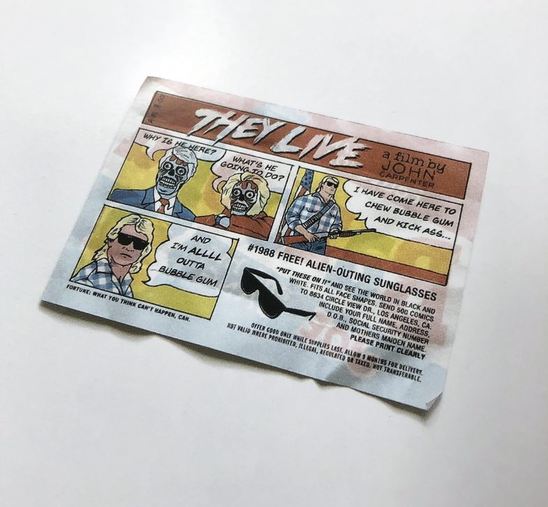
The discarded wrapper lies solo on the reverse of the inner sleeve and the chewed up gum itself shows up mid-magazine, sticking the middle pages shut in a simple but graphic gesture of defiance befitting our antagonistic hero.

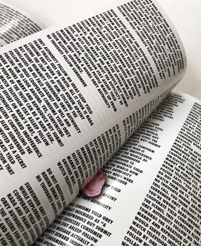
The magazine part of the package contains extensive essays and interviews. Typeset in imposing columns of heavy text – a tough read under normal circumstances but made excruciatingly more difficult through interspersing every second line with subversive slogans from the movie. Literally forcing the reader to read between the lines to extract the relevant information.

Often times the most daunting part of designing gatefold packaging is…. the inside gatefold. In the context of a record sleeve it can loom a very large space and it was the final thing I worked on for the They Live package. I tried a lot of different approaches hoping something would work; illustrative directions, black and white newspaper collages, giant dollar bills, silhouetted palm trees in L.A., but nothing seemed to fit with the rest of the design or it was just reminiscent of bad street art.

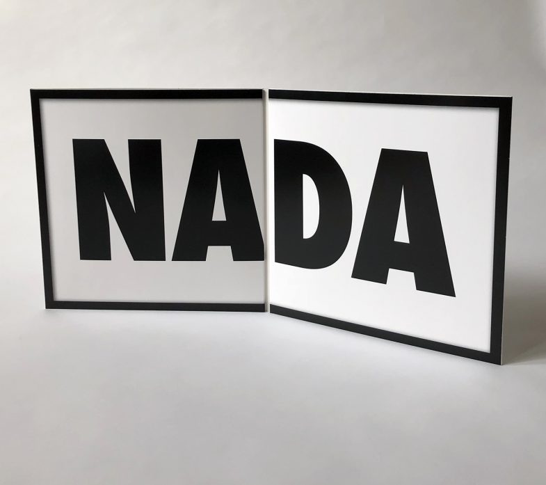
It turned out the solution was right in front of me the whole time, just as They Live had forewarned. So I donned my own pair of sunglasses and true to the spirit of the movie I filled the space with the only thing that really made sense. A big fat nothing.

Read more

JACK’S BACK!

Graphic Design, Music, Posters, Printmaking, typography, Uncategorized

No Comments


Share this post

Jack’s back! Jack white is touring again after a 3 year hiatus so that means new posters. This one I designed for last nights show in Austin TX. Is available now in my shop:

18″x 24″ screen print, Signed and numbered in an edition of 441.

This poster design started out as a ransom note style assemblage using letters from Jack White’s past record covers – based loosely on the bank robber motif from the song “hypermisophoniac”.

There are 59 letters in “Jack White Live at the Austin 360 Amphitheater, Austin TX. May 2nd 2018”, not all of them easily culled from Jacks’ back catalogue, and after poring over the old album artwork, it soon became apparent it would be a hopeless pursuit.

I abandoned the idea and started to bin the letters I had begun to work with. The last piece of paper I picked up was the “h” from White Stripes “Elephant” torn in a sort of triangle shape. Possibly because I had Texas on my mind it immediately reminded me of the bottom part of that states’ unique shape. After that, the image pretty much designed itself. A quick look at the front and back covers of the music and I had found the letters that would both fit together to represent the shape of Texas and spell out  Jack White.

I don’t generally start slicing and tearing up my records and cd’s for poster designs so I hand cut the various letters from different types of card and paper at the necessary size. Utilising different papers whilst crumpling some parts and tearing others allowed for a range of textures to be present in the final image and makes for a more interesting design overall.

The one letter I had some trouble with was the J, It’s not a letter that shows up readily  on his other bands’ releases. I eventually decided I would have to include Jack’s solo work in the available options. Initially I didn’t like the J from BHR; it seemed quite plain in comparison to the more elaborate retro stylings of the other letters but in retrospect I think it’s a necessary element, it provides a nice counterpoint and the contrast represents both visually and metaphorically the past and present of Jack Whites’ music.


Read more

S̶M̶O̶K̶I̶N̶G̶ THE KILLS

Graphic Design, Music, Posters, Printmaking, typography

Comments Closed


Share this post

A set of screen printed concert posters for the opening three nights of The Kills tour, on the road in support of their new album Ash and Ice. For a band that seems to celebrate smoking as much as the Kills do,  I felt defiantly defacing the ubiquitous warning label from cigarette packs was the only direction to take for this poster.

I have always wanted to put a hole through a stack of posters for various reasons. As it turns out, it’s quite a bit more complicated than I had guessed if any degree of control is to be maintained. After a few near disasters and a little expert help there were only a couple of poster casualties and I think the end result is pretty convincing with each ‘cigarette burn’ being unique to each poster.

Limited copies of all three versions are available here

killsPomonaBLUE

killsLosAngelesGOLD

killsSanDiegoPINK

Read more

NETFLIX’ NARCOS – SEASON 2 POSTER

Film posters, Graphic Design, Posters, Printmaking, typography

Comments Closed


Share this post

I was recently commissioned to create a screenprinted poster design for Narcos – Netflix’ fantastic serial on the life and demise of notorious cartel kingpin Pablo Escobar. Season two tells of Pablo’s escape from prison and his subsequent death.


narcos poster


Mondo requested I provide some process photos detailing how I went about creating the poster image.  I declined due to fear of exposure, but have since been alerted to surveillance photos captured during the timeframe posted on Mondo’s very own site.

narcosphoto1 narcosphoto2 narcosphoto3 narcosphoto4 narcosphoto5 narcosphoto6


Read more

BOTTLE ROYALE!

Graphic Design, Music, Posters

Comments Closed


Share this post

New concert poster for Puscifer, a side project of Maynard James Keenan from the Grammy Award-winning band Tool.

Touring with a Lucha Libre themed stage show and new album, this image is my variation of the famous Rubin’s Vase illusion and features two luchadores preparing to battle it out over the Mezcal worm.

Posters are 18″ by 24″ screenprints with a metallic ink and are available in my shop.

Show Edition (blue) of 175

HYNES_PUSCIFER_BottleRoyale_blue


Variant Edition (green) of 30

HYNES_PusciferBottleRoyale_green


Read more

THE FINAL GIRLS

Film posters, Graphic Design, Posters

Comments Closed


Share this post

Mondo commissioned poster for The Final Girls directed by Todd Strauss-Schulson. An inventive and hilarious horror-comedy riff on typical slasher movie tropes.

A young woman grieving the loss of her mother, star of an infamous 80’s horror, finds herself mysteriously trapped inside the cult classic movie during an anniversary screening. Reunited, the women must fight off the film’s machete-wielding killer.

FinalGirlsQuad


Read more

PRIMUS & THE CHOCOLATE FACTORY GOLDEN VARIANT GIVEAWAY!!!

Graphic Design, Posters, Printmaking

Comments Closed


Share this post

goldvarPrimus are ending their final shows ever touring with their twisted musical interpretation of the famous film and In keeping with the spirit of the original movie that-inspired-the-band-that-inspired-the-record-that-inspired-the-poster, (and after talking at length with Mr. Wilder in a dream), I have chosen to disregard the overpriced and underwhelming!, the uninspired and all-conforming! the vapid and the unvarying variant!
I have decided to give!, not sell!, but GIVE! these rarest of rare Golden Variants away!

Five Golden Variants! have been randomly inserted into custom candy cane tubes amongst a limited number of the original show posters.

 a further..

Five Golden Variantshave been randomly inserted into custom candy cane tubes amongst a limited number of the variant colourway posters.

Whether you see an optical illusion within an optical illusion or the terrible irony of an Oompa Loompa putting in hours on Labor Day, I urge you to take advantage of this once in a lifetime gamble!

Designer signed and numbered Copies of both regular and variant versions of the poster go for sale my webstore  Friday, Sept 18th at 12.00 PST 

Variant copies of the poster will ship later than the regular show versions of the poster, please see each listing for more details.

Purchase of either the regular version of the concert poster or the variant of the concert poster does not a Golden Variant guarantee, but whichever poster you receive, I sincerely hope, happy you shall be!

Hynes_primusNE_smallgoldHynes_primusNE_smallregHynes_primusNE_small var

Read more

PRIMUS WITH DINOSAUR JR. CONCERT POSTER

Graphic Design, Music, Posters, Printmaking

Comments Closed


Share this post

Poster for Primus at Eagles Ballroom, Milwaukee WI. 08/06/15

18″ x 24″ Edition of 225 signed and numbered
4 colour screen print

Get it here

primus blue


primusorange

Read more

‘TIS THE SEA SON

Graphic Design, typography

Comments Closed


Share this post

In true holiday fashion this years Christmas card incorporates the Unholy Trinity of Graphic Design;  clip art, bad puns and Comic Sans.

*Quick shipping note – all orders through my site will ship the first week of January, apologies for any inconvenience. Happy Holidays!!

hynesxmascard14

Read more

“THE UNPLAYABLE PIECE” – GRAND PIANO SOUNDTRACK 7″

Graphic Design, Music, Record Covers

Comments Closed


Share this post


GrandPiano_Side_sm_blog_grande

I recently completed this limited edition package design for the soundtrack to Grand Piano, a Hitchcockian thriller starring Elijah Wood, John Cusack and Alex Winter. Elijah Wood plays Tom Selznick a once promising pianist returning for a comeback performance, only to be the target of a sniper who will kill him if he plays one wrong note. Directed by the talented Eugenio Mira who also wrote the score, the music at the heart of this film is “La Cinquette,” a complicated piano work known as the “The Unplayable Piece”.

I designed the custom 7″ sleeve for Mondo as a formal invitation to the recital from the film, embossed with gold foil on the front, interior and back. The piano cover can be propped up with the flap used to access the record and when opened reveals the keys to be snipers bullets.

A small number of the vinyl records were pressed without a centre hole, making it a truly Unplayable Piece. More info here

GrandPiano_Front_sm_blog_grandeGrandPiano_Inside_sm_blog_grandeGrandPiano_LP_sm_blog_grandeGrandPiano_back_sm_blog_grande

Read more