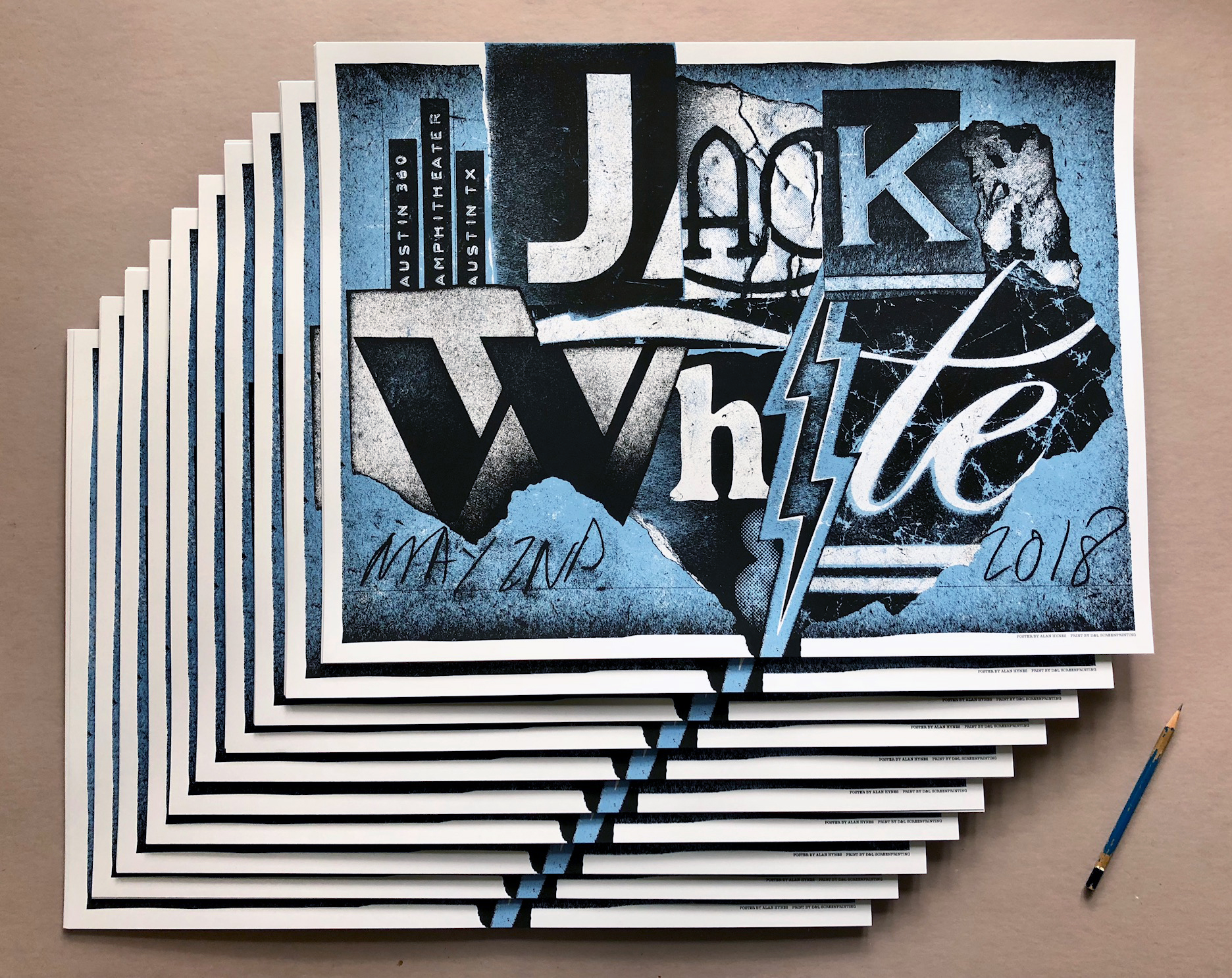
Jack’s back! Jack white is touring again after a 3 year hiatus so that means new posters. This one I designed for last nights show in Austin TX. Is available now in my shop:
18″x 24″ screen print, Signed and numbered in an edition of 441.
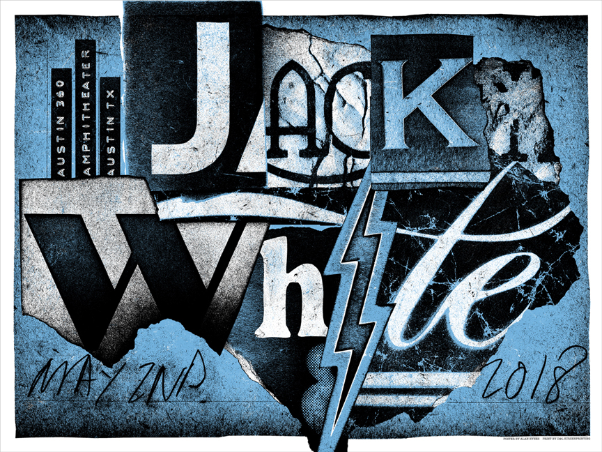
This poster design started out as a ransom note style assemblage using letters from Jack White’s past record covers – based loosely on the bank robber motif from the song “hypermisophoniac”.
There are 59 letters in “Jack White Live at the Austin 360 Amphitheater, Austin TX. May 2nd 2018”, not all of them easily culled from Jacks’ back catalogue, and after poring over the old album artwork, it soon became apparent it would be a hopeless pursuit.
I abandoned the idea and started to bin the letters I had begun to work with. The last piece of paper I picked up was the “h” from White Stripes “Elephant” torn in a sort of triangle shape. Possibly because I had Texas on my mind it immediately reminded me of the bottom part of that states’ unique shape. After that, the image pretty much designed itself. A quick look at the front and back covers of the music and I had found the letters that would both fit together to represent the shape of Texas and spell out Jack White.
I don’t generally start slicing and tearing up my records and cd’s for poster designs so I hand cut the various letters from different types of card and paper at the necessary size. Utilising different papers whilst crumpling some parts and tearing others allowed for a range of textures to be present in the final image and makes for a more interesting design overall.
The one letter I had some trouble with was the J, It’s not a letter that shows up readily on his other bands’ releases. I eventually decided I would have to include Jack’s solo work in the available options. Initially I didn’t like the J from BHR; it seemed quite plain in comparison to the more elaborate retro stylings of the other letters but in retrospect I think it’s a necessary element, it provides a nice counterpoint and the contrast represents both visually and metaphorically the past and present of Jack Whites’ music.