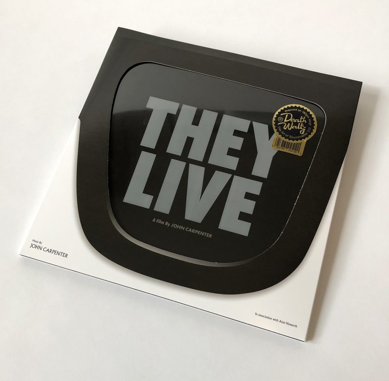
Design for Death Waltz’ re-issue of John Carpenter’s original score for 1988’s They Live. Read below for an insight into my design process and check out the Mondo video linked here the see the packaging in action.
As of this writing, January 2019, google returns 9,860,000,000 hits for the search term “They Live” – that’s almost 10 Billion. TEN BILLION!!!. Since its release 30 years ago so much has been written about this films’ continued relevance; it’s prophetic vision, it’s commentary on capitalism and conformity and of course its legendary six-minute fight scene.
Coupled with so many prominent artists influenced by and appropriating its visual currency and language, to say that John Carpenters’ cult classic has permeated the fabric of our popular culture would be a massive understatement. In fact They Live is not so much a cult classic as much as it is simply just a classic.
Rather than redundantly discuss further the movies lasting impact I will instead outline my approach to the more mundane design related aspects and how I incorporated some of the themes and ideas from the film into the packaging for the soundtrack.
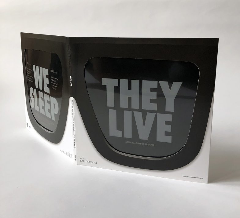
First let’s be clear about what this package actually encompasses and what the design entailed; It’s a pair of glasses, it’s a record sleeve, it’s an advertising campaign, it’s a magazine, and it’s a magic trick. It involved packaging design, product naming, product branding, logo design, copywriting, photography and illustration. All of these elements had to be individually conceived and created but also had to work in tandem to create a cohesive design relevant to the movie.
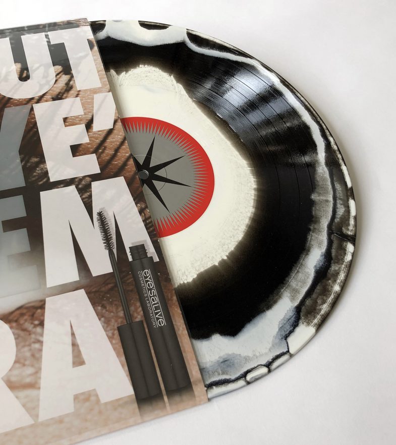
In the film a pair of sunglasses reveals a hidden reality, and as per movie the putting on and taking off of the glasses is mimicked through the action of sliding the record in and out of its sleeve – with the stark white letters of the title magically changing to a full color advertisement.
The trick itself is based on an old rainy-day paper construction activity for children wherein a black and white drawing amazingly appears to fill with color as it slides out from a sleeve. For the record packaging I adapted the effect to work typographically, sticking with the iconic Futura Extra Bold Condensed typeface that is so synonymous with the film’s iconography.
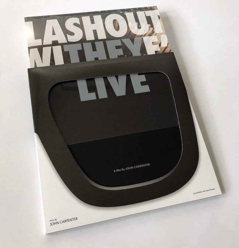
Magic tricks work within strict parameters and these placed substantial restrictions on the rest of the packaging. It meant that a large part of the design was dictated by where the letters “THEY LIVE” and “WE SLEEP” sat on the front and back covers. This required not only creating the product, naming it and branding it, but also coming up with ad slogans that included those exact letters, in that exact order, that fit within the space, and that made sense as slogans in relation to the products they were advertising. Phew.
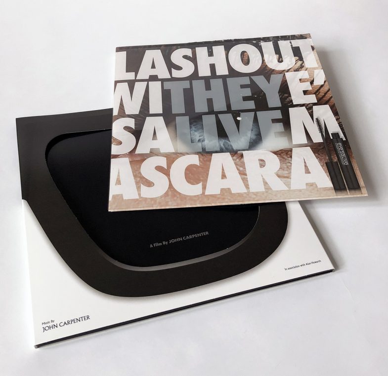
The two products depicted in the ads represent the alien and the human demographic respectively. For it’s ability to conceal I chose to use a cosmetics product as a metaphor for the hidden oppressors, and the slightly aggressive language of the “Lash-Out With Eye’sAlive” tagline (spoken in a in a snarky-supermodel-from-London way) aligns with an oppressive alien ruling class and contrasts the vacuous, over-friendly adspeak of the “EverSleep” slogan which innocuously queries before reassuring; “Still Up? Now EverSleep Is Here For U”. The newly formulated sleep aid promises slumber and I have used it as a less than subtle representation of the oblivious state of most of the human populace depicted in the story.
Ironically the grammatically incorrect but vaguely faux-Euro looking eye’salive name for the mascara product was conjured up as a result of the kerning problems the ad slogan created. In retrospect it makes for a more memorable and appropriate brand logo by virtue of its’ unnecessary inclusion and is somewhat representative of the superfluous trappings of the industry.
For the insert I applied the best known, or at least the most oft-repeated line from the film: “I have come here to chew bubblegum and kick ass, and I’m allll outta’ bubblegum” to a Bazooka Joe style comic wrapper. Whilst thankfully I didn’t have to write the dialogue for this element of the package design, the 3 panel comic strip still needed drawing.
I am not a cartoonist and it took a few attempts – best described as ‘learning experiences’ before I was able to produce an acceptable facsimile of the style. Further subversive details from the movie are contained within the familiar free offer text below the comic strip.
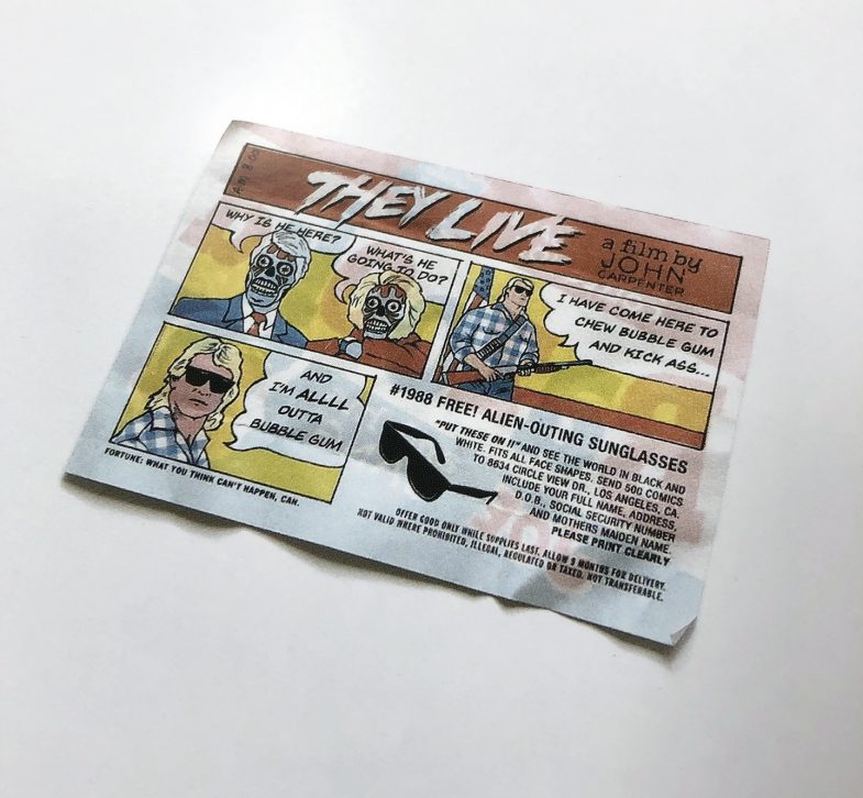
The discarded wrapper lies solo on the reverse of the inner sleeve and the chewed up gum itself shows up mid-magazine, sticking the middle pages shut in a simple but graphic gesture of defiance befitting our antagonistic hero.
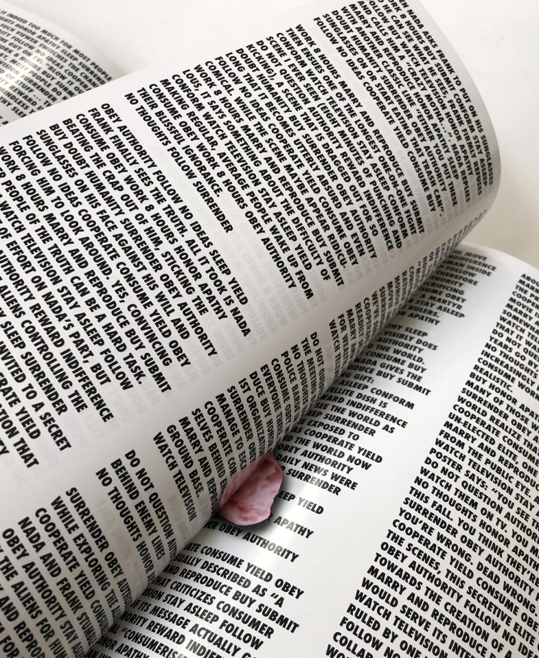
The magazine part of the package contains extensive essays and interviews. Typeset in imposing columns of heavy text – a tough read under normal circumstances but made excruciatingly more difficult through interspersing every second line with subversive slogans from the movie. Literally forcing the reader to read between the lines to extract the relevant information.
Often times the most daunting part of designing gatefold packaging is…. the inside gatefold. In the context of a record sleeve it can loom a very large space and it was the final thing I worked on for the They Live package. I tried a lot of different approaches hoping something would work; illustrative directions, black and white newspaper collages, giant dollar bills, silhouetted palm trees in L.A., but nothing seemed to fit with the rest of the design or it was just reminiscent of bad street art.
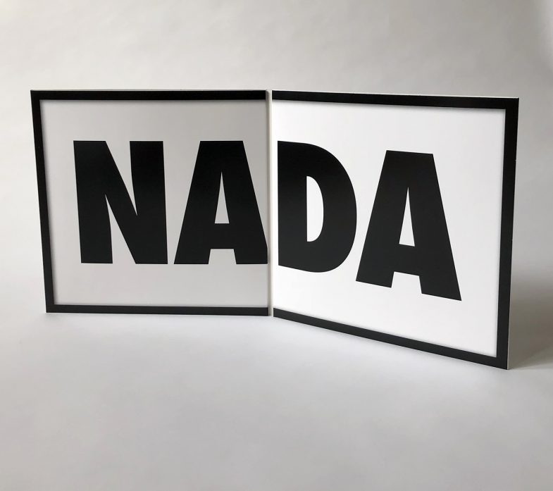
It turned out the solution was right in front of me the whole time, just as They Live had forewarned. So I donned my own pair of sunglasses and true to the spirit of the movie I filled the space with the only thing that really made sense. A big fat nothing.