Whilst organising work from last year over the holidays I realized there were a number of projects, that for one reason or another, never saw the light of day or were scuttled midway through. I generally try to create imagery specific to a particular project so I don’t often go back and repurpose a lot of this stuff, it pretty much sits in a folder on my hard drive and I never think about it again. In the interest of not completely wasting this work, I’ve decided to showcase a few unfinished projects from 2012.
PART ONE: Spiritualized
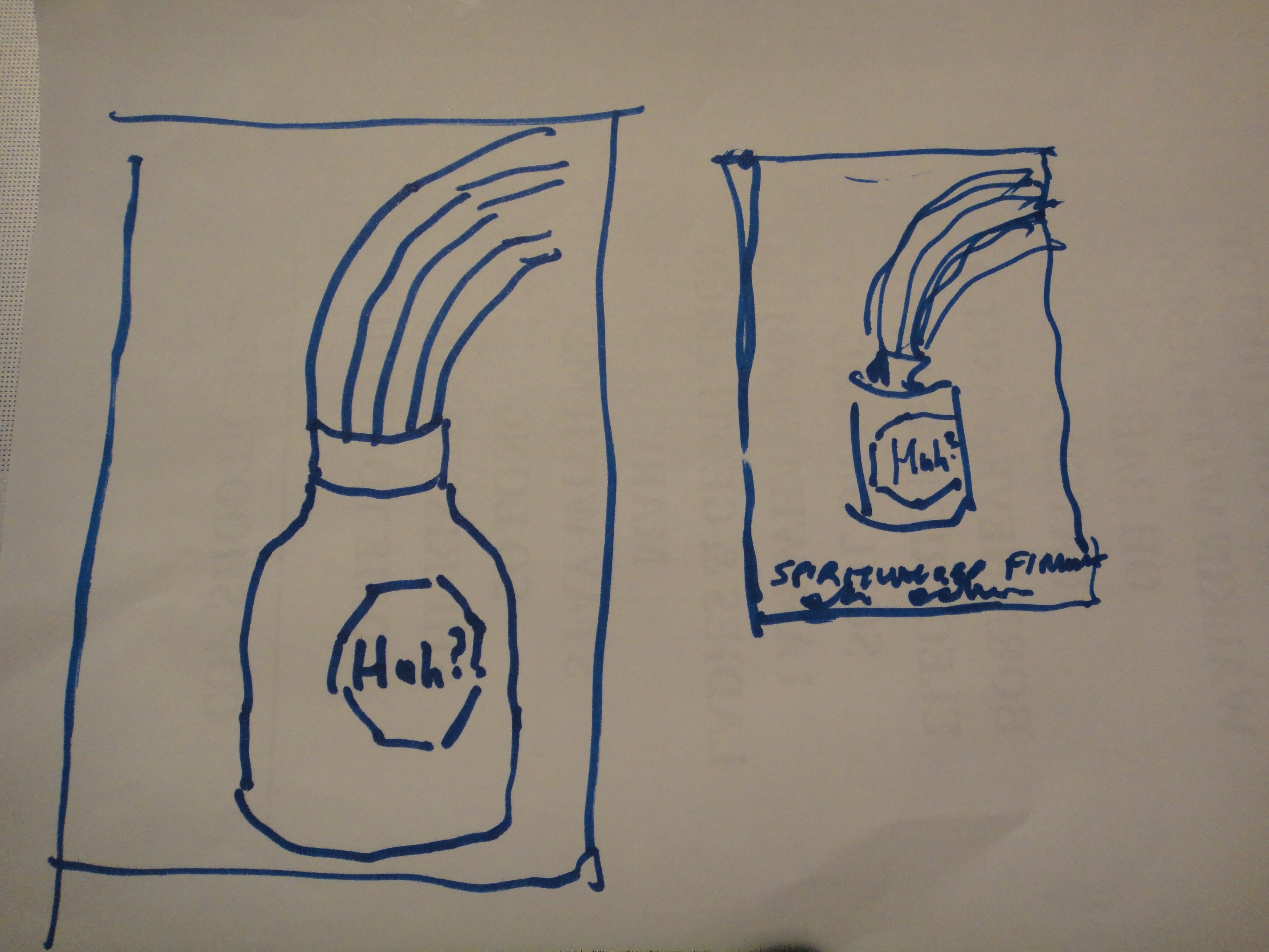
5/11/12 6:20 PM – I was contacted by Secret Serpents to design a concert poster for english space rock band Spiritualized, I’d always been a fan of their design and innovative packaging for cds – the aesthetic was like Damien Hirst crossed with Peter Saville’s designs for Factory records, clinical but a little macabre so I was excited to take on the job and create a design in a similar vein. Despite the very limited timeframe I said yes and Jason Pearse sent over his concept partly based on their last record, an oldstyle morphine bottle and a rainbow.

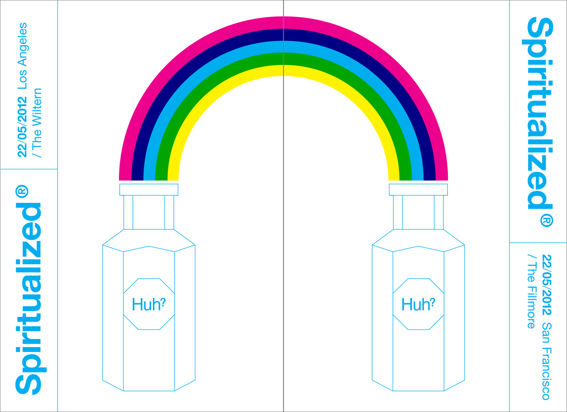
My initial reaction to the sketch was, Huh? but due to the fact that there were two dates I saw an opportunity to make two posters that joined, completing the rainbow and potentially encouraging a double purchase at the merch booth. I felt it added to the original idea but I still wasn’t really convinced or that excited about it overall. Also, screenprinting the rainbow required three screens which bumped up the cost and time required to produce it, both of which were in short supply.

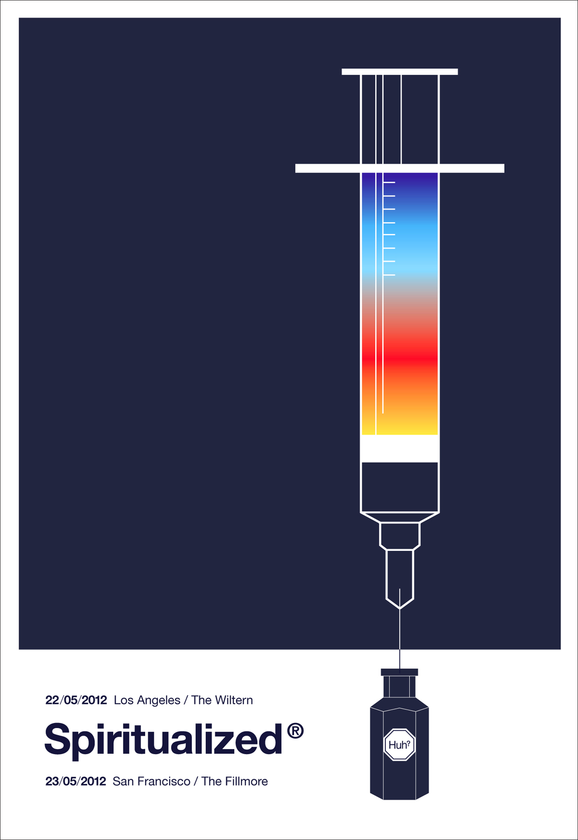
I decided to do my own take on what I thought Jasons’ idea was and include it with the other designs, I was also able to keep it to 2 screens utilizing a simple blend to create the rainbow, a cheaper less time consuming option. I think its graphically stronger than the other designs and follows their aesthetic nicely, I also feel it gets the original idea across better.

5/13/12 9:03 PM – Designs are sent for approval.
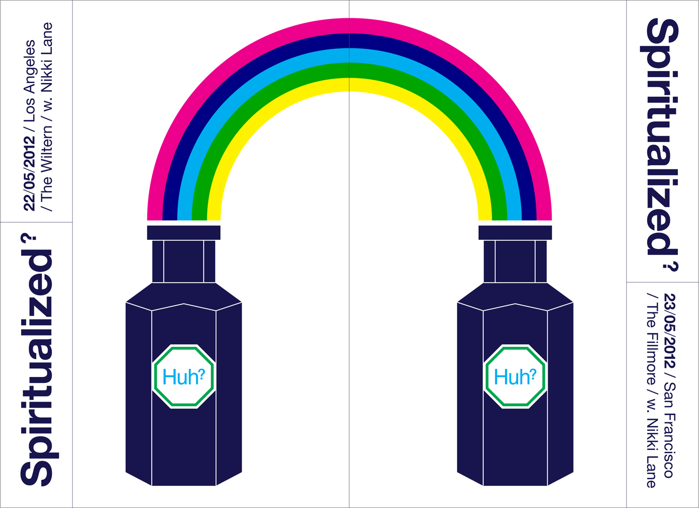
5/14/12 7:10 PM – Initial ‘double rainbow’ posters are approved with the following changes:
1. Need to use the dark blue colour for the typeface (as on the syringe design)
2. Spiritualized? as logo, question mark rather than the trademark symbol (see attached jpg)
3. Bottle to be dark blue (as on the syringe design)
4. Huh? logo on bottle to be green + blue typeface as album cover (see attached jpg)
5. / With Nikki Lane after the venue names

5/14/12 8:06 PM – 2nd round posters with changes are sent for approval. The new design would now require seven screens to print and with one week till the show, printing options are rapidly disappearing.
5/15/12 – Rush job digital printing options explored and priced. Still awaiting approval on 2nd round changes.
5/18/12 – 3 days till the show, printing options are all but gone, job is cancelled and files are relegated to my FOR BACKUP folder.