When starting a new poster (or in this case a set of three) I never disregard a bands prior designs oftentimes using them for inspiration or continuity through my design – It makes little sense especially for such an established band like Sigur Ros to jump around styles and themes too much, so I generally try to keep at least a thread of what I see as their look running through my take on the imagery, be it as simple as a color or font choice. I thought I had a pretty good grasp of Sigur Ros’ existing aesthetic, sort of a faded, misty look with a touch of psychadelia thrown in. Friendly handwritten type and boats, birds and butterflies – A lot of them. Not that memorable or exciting really but I could see how it meshed with the ethereal nature of the music. I got to work.
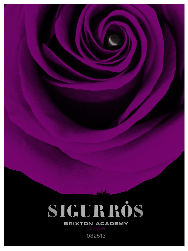
The word ‘ros’ is icelandic for rose which in my first comp makes for a seafaring night sky whilst simple ink marks exploding from the domeless venue reference the northern lights, geysers and volcanos of Iceland, a nod to their homeland and the spontaneous, painterly feel to the music. I was a little surprised to receive quick feedback that they were “too cute” which told me a little, but not really that much.
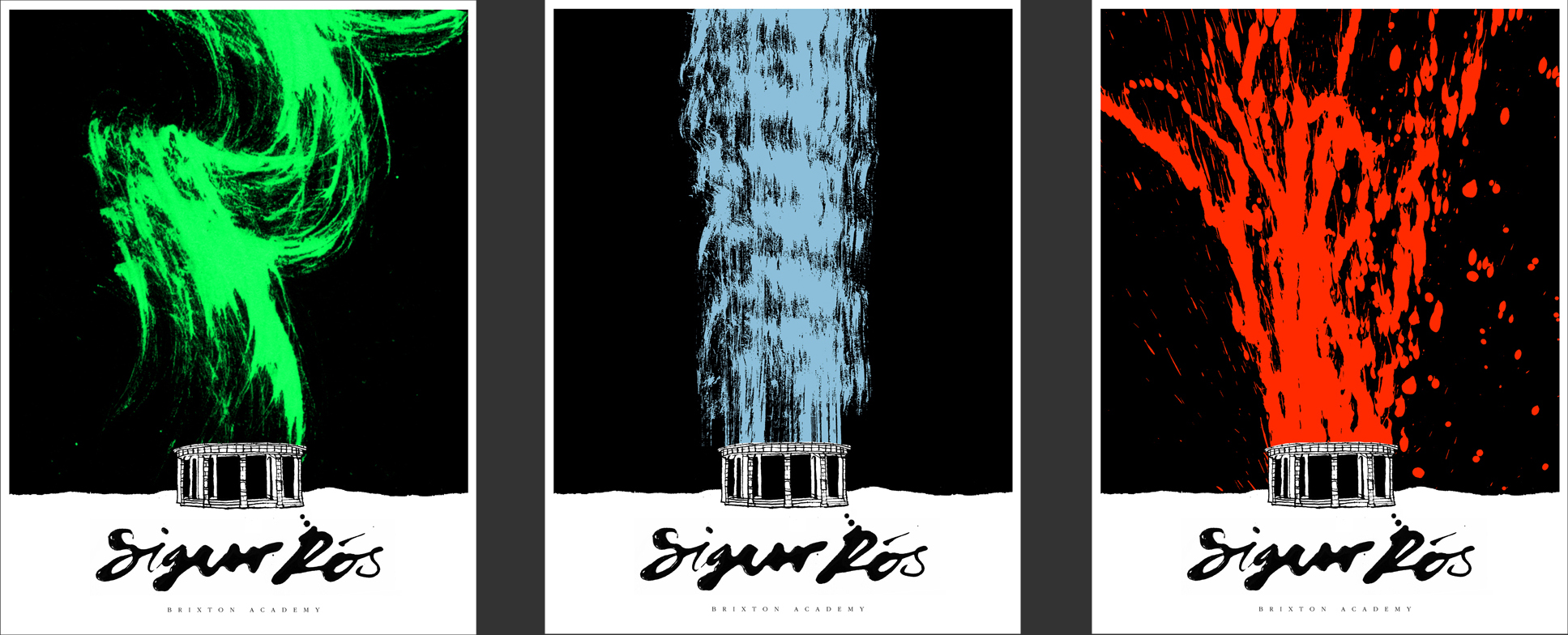
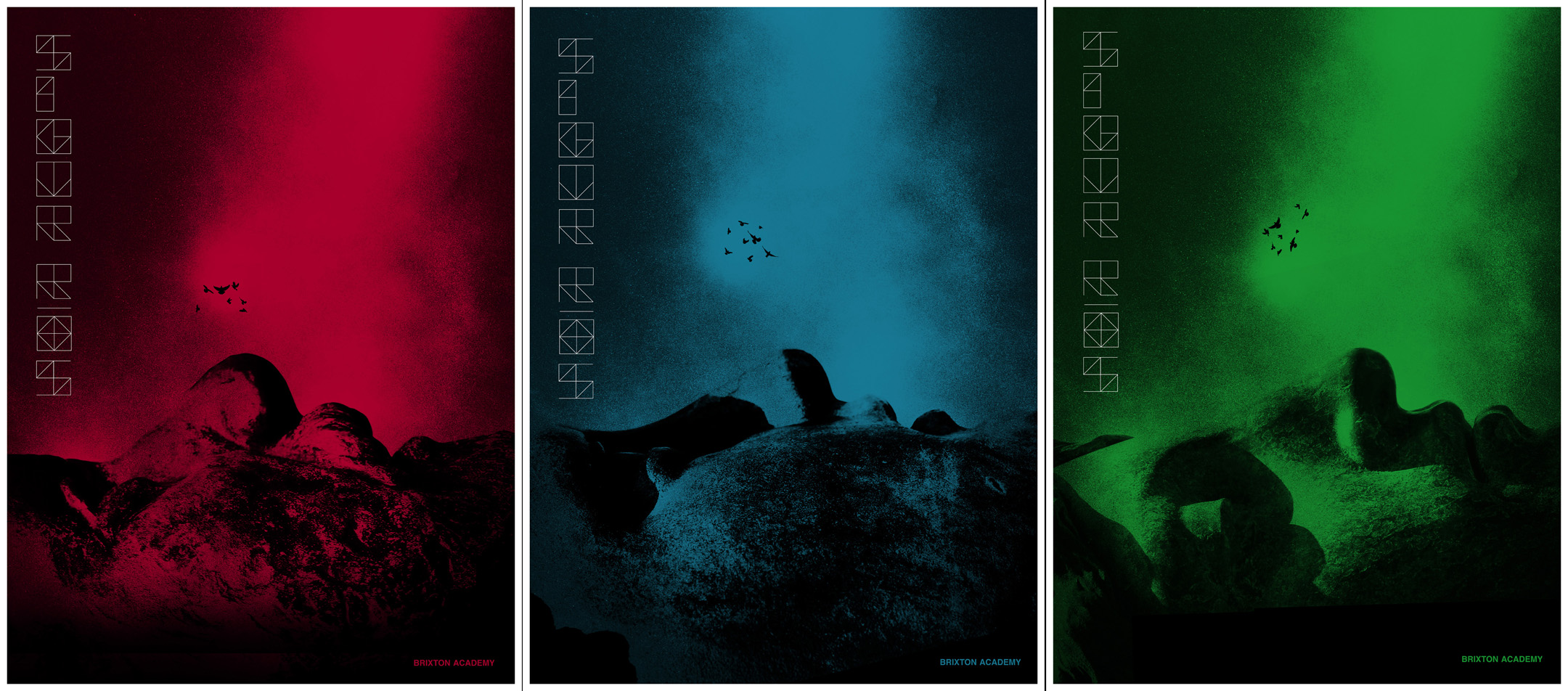
For the next round of comps I used statue faces as sort of surreal landscapes inspired by the otherworldly natural features of Iceland. Taking a cue from the bands live show I referenced the atmospheric smoke and coloured lighting which became breath coming from the statues mouth, bringing the landscape to life. The birds increase in number as per the show dates (7,8,9) and the type was inspired by the decorative pattern on the front of the Brixton Academy.
I was fairly confident with this set of designs, thinking they worked well as a set and fit the band, so again i was surprised to receive some rather frustrated sounding feedback: “I just wish they would stop trying to design how they think we would want it designed. they should just do their thing, make it as out there as possible really”
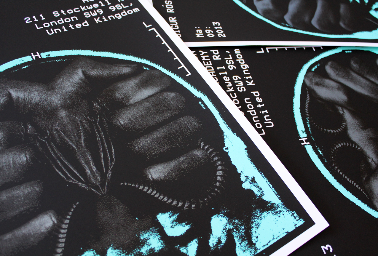
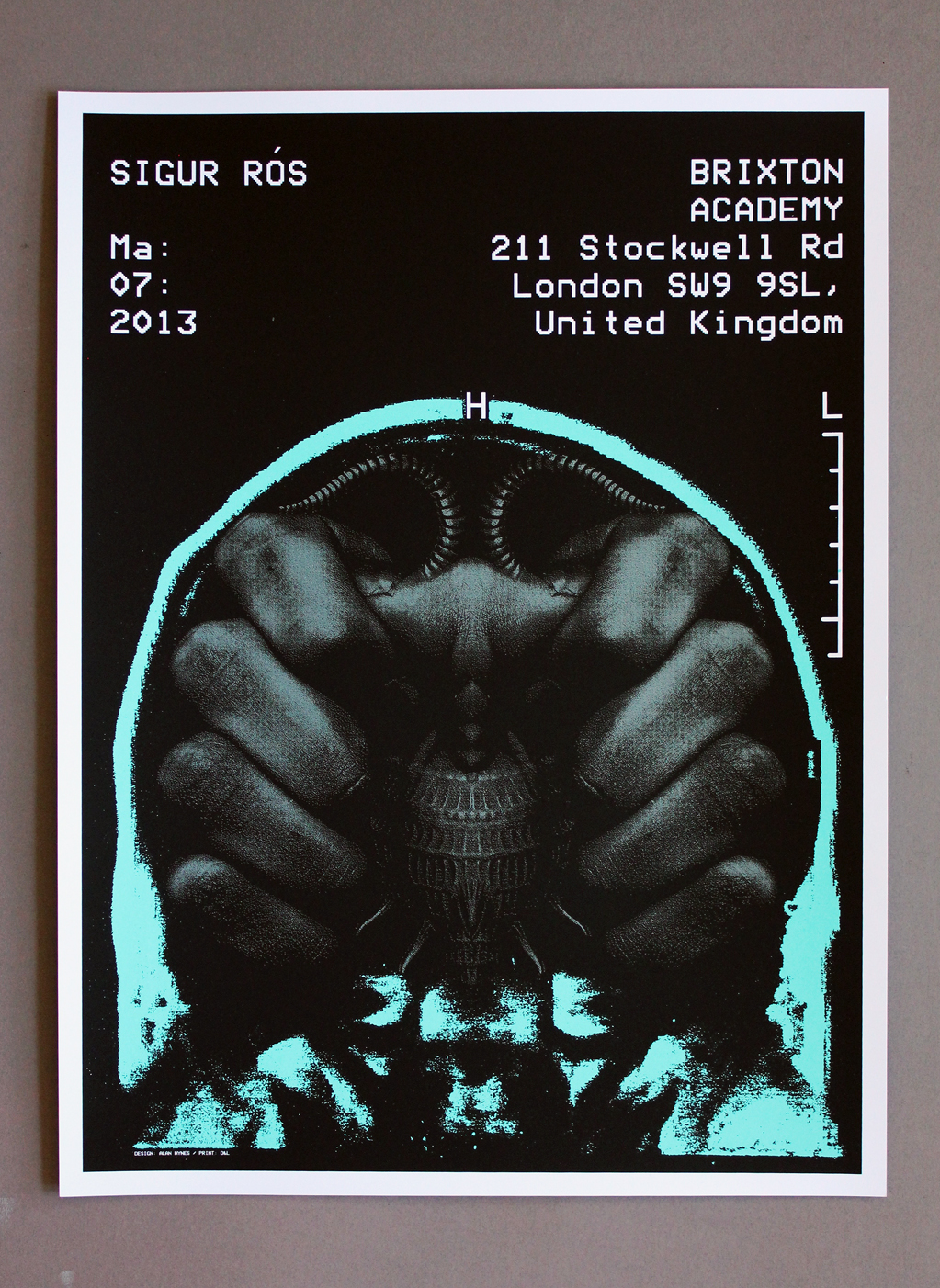
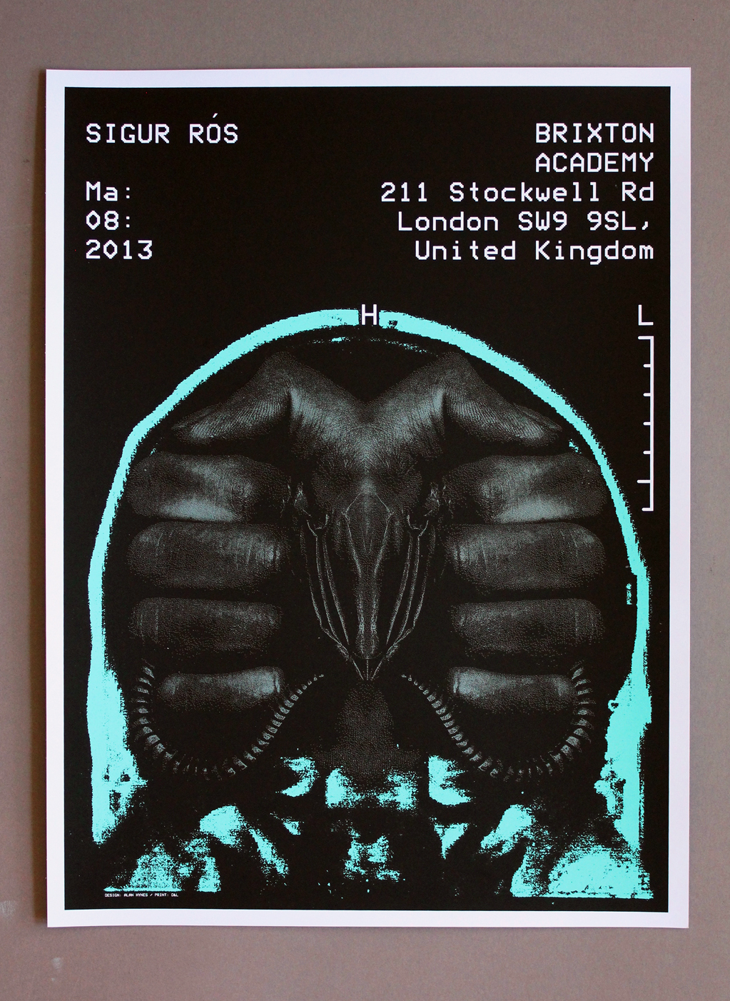
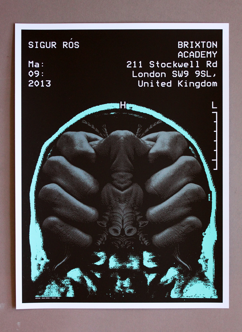
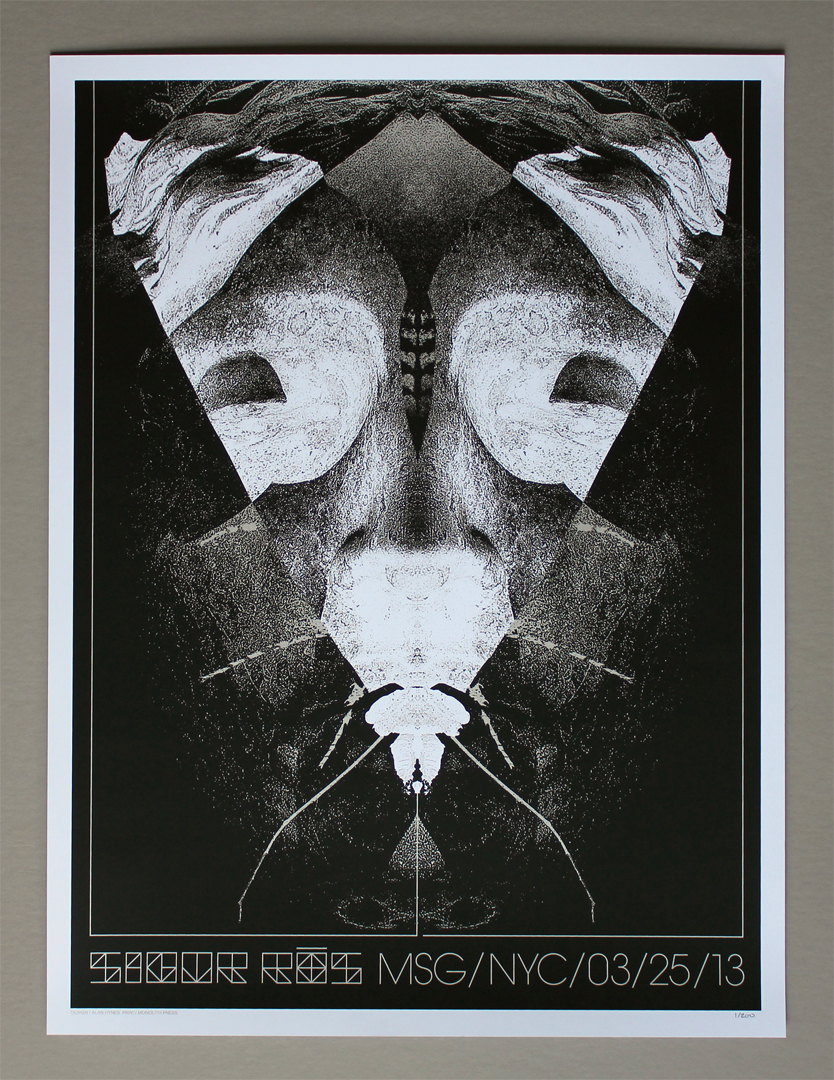
Enter; the “brain bugs”. I’m guessing these designs were in part a reaction to how the looming deadline, two rounds of rejections and a lack of inspiration was starting to wreck my head, but they had referenced a previous poster I had made for Jack White so I returned to my fascination with xray film and monospaced type and ended with these cat-scan style images. Hands are pretty creepy sometimes and the brainlike fleshiness of the fingers combined with the cold, clinical (and somewhat ominous) nature of a brainscan make for an interesting combination.
I’ve never been asked to deviate so drastically from a bands pre-existing aesthetic or look and it was a challenging task, in fact i’m still having a little bit of a hard time reconciling these poster images with the band and its music. Over time, every design associated with a band (or product, or company) adds to a visual language and once you learn it, its kind of hard to un-learn. As a designer I found it extra difficult and at times frustrating but in terms of becoming a better designer, i suppose i’m grateful to have had an opportunity to have gone through the process.
— Read more
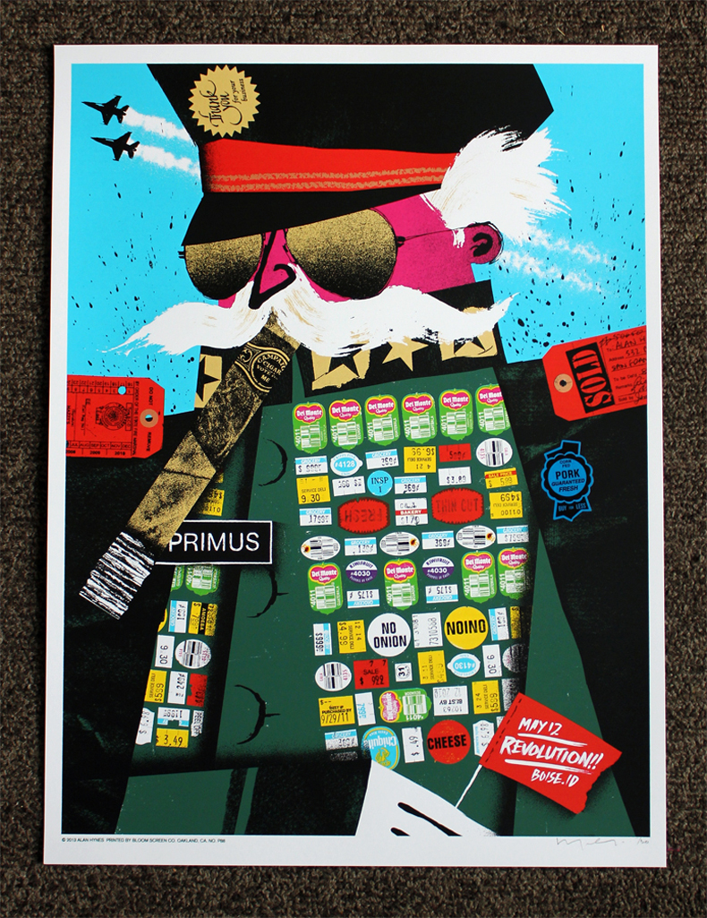
 The National Poster Retrospecticus is a traveling show of more than 300 hand-printed event posters from over 75 of the most prominent poster designers in the country. Produced by